
RGB, CMYK And LAB, Oh My!
Designing For Web and Print Media
When designing graphics for your business, it’s essential to think about what applications the art will be used for. Is the art or graphic going on your website, or do you plan to print it? If you’re printing the art, is it important that the color printed stays accurate? Knowing the answers to those questions will help you decide what color model to use.
What Are Color Models?
Color models are the different ways that colors can be combined to create an image. Think of them like different languages. They use different approaches to communicate a similar idea of how to display color. The three most commonly used color models are RGB, CMYK and LAB. In this article, our graphic design experts will explain the differences between each color model and its use in design.
RGB
RGB is an additive color model, meaning two or more colors or intensities of light are added to white to create new colors. The absence of that light creates black. For example, if you wanted to create a purple color, you would add red and blue. All electronic display screens use this color model to show color. This includes examples such as TVs, computers, mobile phones, and projectors.
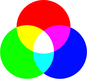
The problem with RGB is that it is a device-dependent color mode. Different screens reproduce RGB color differently from manufacturer to manufacturer. Even the same display can produce different color responses over time as it ages. Some displays are made to reproduce color as accurately as possible. However, these displays are costly and still can’t reproduce the whole spectrum of color.
CMYK
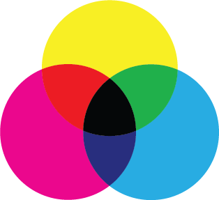
CMYK stands for Cyan, Magenta, Yellow, and Key Plate. In traditional printing methods, the key plate is often black and is the plate that holds the most detail in the image. Unlike RGB, it is a subtractive color model. This is because the inks “subtract” colors from white light instead of adding to it and can create black through a combination of the colored ink. However, printers generally use black ink instead of combining them to save money and produce much deeper black tones. Take the purple color example above. Instead of adding red and blue like with RGB, you would combine magenta and black.
The CMYK color model is also known as process color or four-color printing, and is the standard by which the printing industry operates. This is because while RGB colors produce lighter colors on a display, laying RGB inks on top of each other produces much darker colors. Due the fact that CMYK is a subtractive method, CMY covers most lighter color ranges easily in comparison. This is what makes it a far better model to use for print.
Why Do I Need To Design In Different Color Models?
When you convert a file from RGB to CMYK to print, there are often color shifts. Generally, these shifts are minor and not extremely noticeable. However, they can be an issue if you have a color-sensitive design, such as a logo. The same can be said if you were to upload a CMYK image to the internet. The color becomes completely blown out and turns neon. This is because RGB and CMYK have different color gamuts.
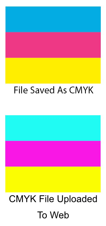
Color Gamut is the range of color a particular color model can accurately reproduce. That range of color varies from color model to color model. RGB has a much larger color gamut than CMYK, meaning you can use many more colors in RGB than you can in CMYK. So your design that looks great in RGB ends up losing its vibrancy when printed. When a color cannot be reproduced in a particular color model, it is considered “out of gamut”. There is also a third color model that encompasses both RGB and CMYK.
CIELAB
CIELAB, also referred to as L*a*b* (you pronounce each letter separately) is a color model that was defined by the International Commission on Illumination. It uses a very different approach to color than RGB and CMYK. While RGB and CMYK describes the components used to create a color, Lab mode describes the appearance of the color. It is able to do this because it uses a 3-axis system to describe the color. The L in Lab stands for lightness, going from L 100 to L 0. The A and B are used to define the color. Lab color takes this different approach because it was designed to mimic the color gamut of human vision.
As a result, it encompasses a far larger color gamut than either the RGB or CMYK. It is also a much more accurate color space than either RGB or CMYK as a result. Because of all of this, color management systems use Lab as a color reference to transform a color from one color space to another color space. Because of it’s unique properties, Lab is a very good color model to use for photography. It is able to punch up colors and make them much more vivid and life like than RGB.
Pantone
Outside of the three color models mention already, there is a proprietary system called the Pantone Matching System Color Model. In 1963, Pantone created the first color matching system, essentially an all in one color model and management system. Before this time, printing companies all had their own color guides. This meant that each had their own idea of what each color looked like. “Orange,” for instance, might be more yellow or red depending on who had printed your work.
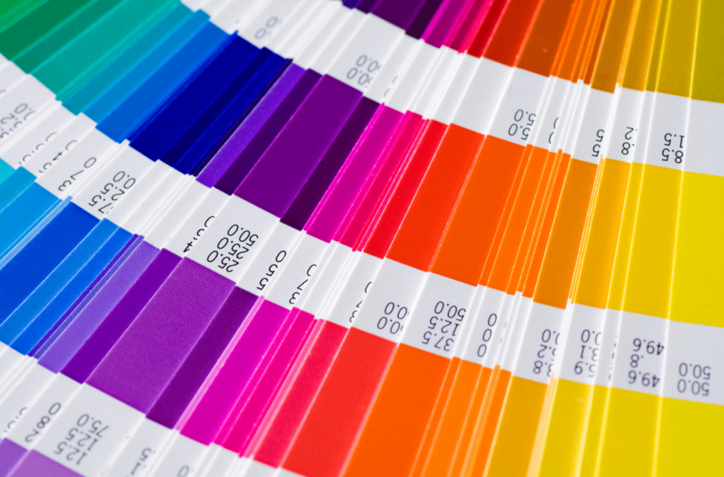
Pantone fixed this by creating a standardized system that all manufactures can work from. They did this by creating 18 basic colors that are mixed to form specific spot colors. Unlike CMYK which is made by dots or screens, Pantone spot colors are solid because they are mixed prior to printing. Designers can easily tell how their color will look once printed by referring to Pantone’s printed color books. Today they include over 1,800 colors in their library, and the system is used worldwide. There are many pros and cons to using Pantone, however.
Pros
- Standardized and very accurate color system
- Used throughout the world
- Able to produce colors that are not possible in CMYK, such as metallics and fluorescents
- Simulates how colors will print on matte, coated or uncoated paper
- Pantone shades can be converted to RGB or CMYK
Cons
- Pantone is a proprietary system and cannot be supported by open-source software
- It costs more to print than CMYK
- It has a much smaller range of colors to choose from
- Pantone swatch books are expensive
By keeping these design principles in mind as you create your designs, you’ll be well on your way to producing uniform and professional artwork for your company across all design formats.
If you have any questions on how you should set up your artwork , feel free to get in touch with us. Give us a call at 618.681.4030 or book online using the handy button above.
Remember, do what you do best, let us do the rest.
About the Author: Jason Shadowen
Related Posts

Getting Started With My Office Help: A Guide for Home Service Businesses In today’s fast-paced and highly competitive market, home service businesses must continually seek ways to enhance efficiency, improve [...]

Top 5 Frustrating Challenges Home Service Businesses Face and How Virtual Support Can Help The home service industry, encompassing a wide range of services such as plumbing, HVAC, electrical work, [...]

A Day in the Life of a Virtual Receptionist: How We Support Home Service Businesses In the bustling world of home service contracting, where every moment counts and each client [...]