What’s in a logo?
How Logo Design Influences Customers
Logos are everywhere, from the clothes you wear to the food you eat. You probably don’t think about them consciously very often. Instead, they are often subconsciously influencing the way you make your purchases. If you are starting a new business, one of the most important decisions you have to make is how to design your logo. Your logo is the symbol of your brand, and if it doesn’t resonate with your prospective customers, you will have to work all the harder to bring them in. With this in mind, our graphic design experts have put together their suggestions on how you can create a great logo that will put your best foot forward.
ARMM model
The first thing to understand is that logo design is just as much of a psychological and scientific process as it is an artistic one. There are four main principles to keep in mind when crafting a logo; attention, meaning, response, and memory. Collectively, these principles are referred to as the ARMM model.
Attention
A well-crafted logo grabs your attention. It does something to make itself stand out from the rest of the crowd. This can be done through the use of color, shape, or even fonts
Response
A great logo also draws an emotional response from prospective customers. It should make them desire whatever your logo is working to promote.
Meaning
Your logo should also give viewers an idea of what your business is and what values your business has
Memory
Last but not least, your logo needs to be easy to recognize and remember. All the marketing in the world won’t make a difference if potential customers don’t remember your brand when making a purchase
Logo Types
There are three primary types of logos—logos that are symbols, logos that are fonts, and then logos that are a combination of both. Within these three types of logos, there are two subsets of a logo, those that are descriptive and those that are non-descriptive. Descriptive logos are meant to give you an idea of what that brand sells. This can be through the name itself or a symbol, or a combination of both. Examples of these include companies like the World Wildlife Fund with their panda or Burger King, which uses a burger symbol along with the descriptive name.
On the other hand, you have companies like McDonald’s that use a non-descriptive logo. When you look at the golden arches, what do you think of? We’d wager a guess that their golden fries were at the forefront. This is intentional; they rely on color psychology and their long, famous history to draw people in.
Color
Blue—Dependable, Trustworthy, Calm
Blue is used in a majority of company logos. Because of the reactions it causes, it is prevalent in industries like technology and finance. Facebook, Twitter, and Skype all use bright shades of blue for this reason.
Yellow—Playfulness, Confidence, Warmth
Yellow is used in many food industries for the same reason as red. Its brightness grabs your eye and makes you feel warm and hopeful. It’s also used in many household brands and brands geared towards older adults, as our vision yellows with age. Due to this, we lose the ability to distinguish between cooler colors easily.
Red—Love, Energy, Passion, Boldness, Attention-Grabbing
As mentioned before, McDonald’s makes heavy use of red in its logo. This is because red also stimulates hunger along with being attention-grabbing. Which also makes it extremely popular to use in food and agricultural industries.
Orange—Happiness, Friendliness, Affordability, Fun
Much like the two colors orange is mixed from, this color combines the brightness of yellow with the bold pop of red. While this color is less commonly used for logos, you will see it most often in the food and technology industries.
Green—Growth, Nature, Freshness, Earthiness
When you think of the color green, what generally comes to mind? For many, the answer is money or nature. Financial institutions and especially energy companies realize this and make heavy use of the color in their logos.
Purple—Imagination, Creativity, Nostalgia, Royalty
A color often attributed to royalty, purple is used far less often than most other colors. Chocolate brands and brands that market to women often use it, such as Cadbury or Curves.
Pink—Femininity, Sweetness, Playfulness
In western culture especially, pink is seen as a feminine color. As such, companies that use pink in the logo are generally trying to target women. Barbie and Justice both take advantage of this.
Brown—Naturalness, Simplicity, Durability
Brown can be used to conjure up images of very different things. On one side of the spectrum, it can denote earth and nature, while the other reminds people of coffee and chocolate. It’s used heavily by coffee and chocolate companies and clothing companies that gear themselves towards work-wear.
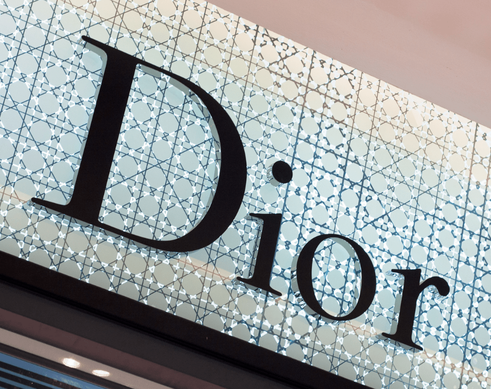
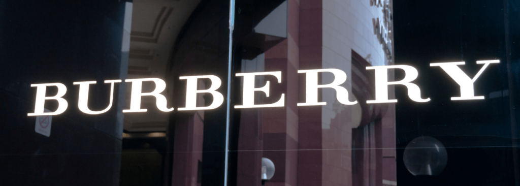
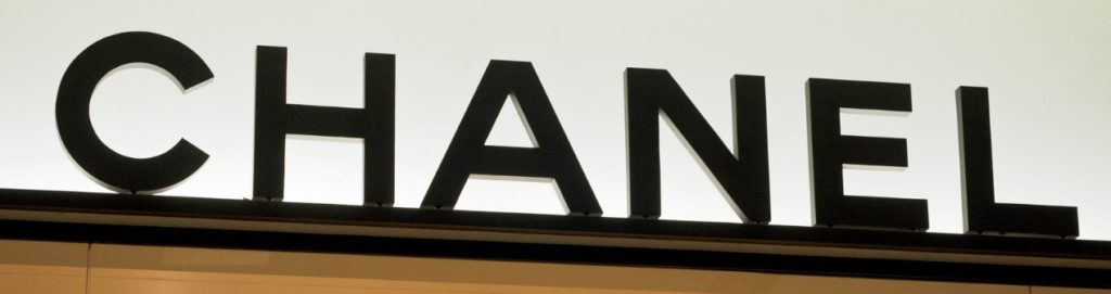
Black—Luxuriousness, Formality, Authority, Timelessness
A neutral color by nature, black is used by many high end, “exclusive” clothing and technology brands. Examples of this include companies like Gucci, Chanel, and Michael Kors.
White—Purity, Cleanliness, Softness, Nobility
No color is as truly neutral as white. It’s used most often by healthcare and cleaning businesses trying to reinforce a feeling of cleanliness or sterility. Because of the common association with purity, white is also used to instill a feeling of trust.
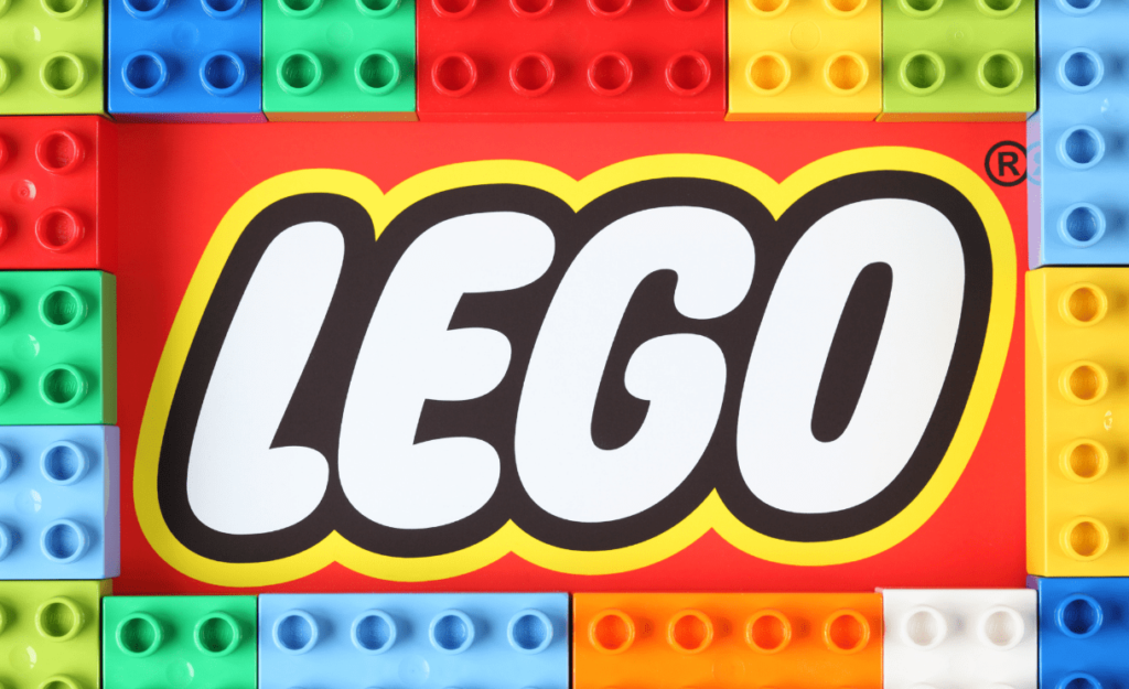
Multi-color—Positivity, Playfulness, Boldness, Boundlessness
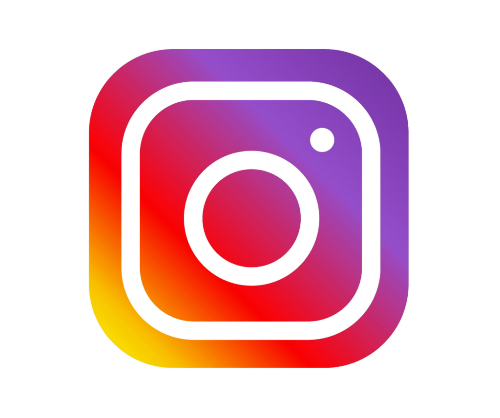
Multi-colored logos (those using more than two or three colors in their brand) are relatively new. We can thank the internet and newer, more economical printing options for this. Many internet companies make sure of bright, multi-color logos. Arguably the most famous of these is Google with their blue, red, green, and yellow typeface. It’s a great way to appear like a fun, playful company and can be a great way to appeal to children.
Shape
Just like color, the shape of a logo has a subconscious effect on our brains. Combining the use of color and shape correctly is very important in getting the response you want. Common shapes include:
Circles and Ovals
- Generally seen as a positive symbol
- Cultures that use rings in marriage see circles as a sign of partnership or stability
- Curves are generally viewed as feminine
Squares, Rectangles, and Triangles
- The most commonly used logo shape
- Seen as familiar, trustworthy, or uniform
- It’s believed that triangles are associated with power, science, and religion
- Often seen with companies that brand themselves toward men
Vertical and Horizontal Lines
- Vertical lines are seen as masculine and strong
- Horizontal lines are seen as calming and imbue a sense of community
- The typeface has a large impact on how both types of lines are viewed
Organic
- Used to creating feelings of softness or delicateness
- Often used by brands that have natural, earth oriented, or have feminine qualities
Font
There are five main styles of font; serif, sans serif, script, display, and hand lettering.
Serif Fonts
This type of font is characterized by a line that extends from the end of a stroke in a letter. It makes it easier to read and improves the flow from one letter to the next. Serif fonts are often used to give logos a classic or timeless look.
Sans Serif Fonts
Sans is the French word for “without,” so it’s fairly obvious to state that this type of font does not have any extra lines coming off of them. Sans serif fonts tend to have the same thickness throughout each letter and convey simplicity and modernity. Most logos today used a sans serif font due to current trends.
Script Fonts
Script fonts are the modern equivalent of hand-lettered calligraphy. They give a sense of elegance and femininity with their typically fluid, cursive strokes. However, they can be harder to read than other font styles, so it’s crucial to be careful when using this style of font.
Display and Decorative Fonts
This type of font does not have a set style. They are unique and often customized for a specific company. They can add a lot of personality to a logo, but you have to consider your audience carefully when using them.
Keeping these elements of design, science and psychology in mind, your first task will be to pinpoint the message you want your logo to convey. Once you have done this, you will be able to craft a logo that appeals to your customers. If this still seems complex, or you’d like your logo to have a more professional touch, feel free to get in touch with us. You can either give us a call at 618.681.4030 or book online using the handy button above.
If this still seems complex, or you’d like your logo to have a more professional touch, feel free to get in touch with us. You can either give us a call at 618.681.4030 or book online using the handy button above.
Remember, do what you do best, let us do the rest.
About the Author: Jason Shadowen
Related Posts

Getting Started With My Office Help: A Guide for Home Service Businesses In today’s fast-paced and highly competitive market, home service businesses must continually seek ways to enhance efficiency, improve [...]
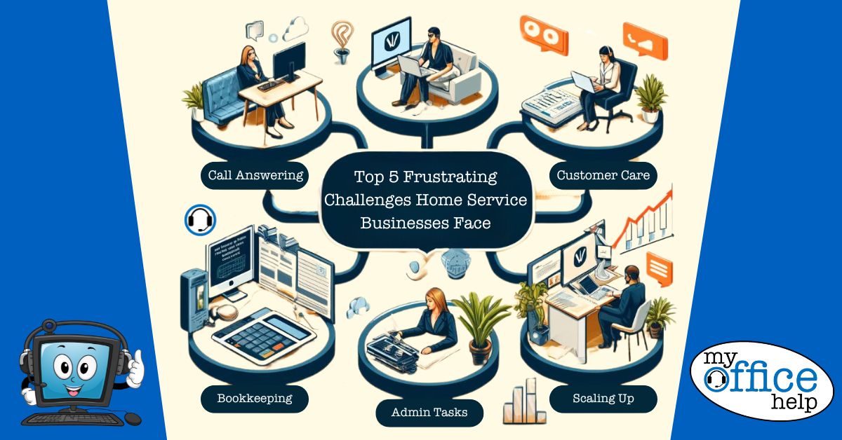
Top 5 Frustrating Challenges Home Service Businesses Face and How Virtual Support Can Help The home service industry, encompassing a wide range of services such as plumbing, HVAC, electrical work, [...]

A Day in the Life of a Virtual Receptionist: How We Support Home Service Businesses In the bustling world of home service contracting, where every moment counts and each client [...]